Website Responsiveness and Application of Media Queries
What is responsive design and why do we need it?
Responsive Design refers to the ability of the web design/UI to not break on different types of devices. In simple words, a web page should look good on 4k screens and on the small mobile device screens. As the size of the screen changes the UI should also change with it instead of breaking.
We need responsiveness because it makes our devices available to more users. We have many tools at our disposal to make a website responsive, some of them are media queries, using scalable units such as rem ,em, and %.
Introduction to media queries
Media queries are a powerful tool that allows us to make our website responsive and adapt to different devices with different screen sizes. It gives us to change the layout depending on the width, height, orientation, and resolution of the device.
The general syntax of media queries is like this:
@media screen and (screen size){

body{
/*somecode*/
}

.someClass{
/*somecode*/
}

}
In the above example, we can see that we are changing the layout or style of the website depending on the screen size of the viewport. We can have multiple media queries for different screen sizes. These screen size breakpoints appear in the dev tools of chrome. If you inspect any page and press ctrl+shift+m you will see the breakpoint at the top right below the website URL
This is an example of the Youtube breakpoint
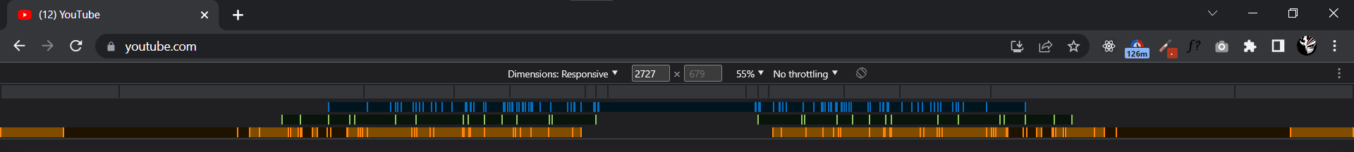
You can see all the vertical thin lines of the color green, yellow and blue are the breakpoints that youtube has. Now don't get all worried as most websites don't even have half of the breakpoints as youtube.
Most websites have 4-6 breakpoints or less or more depending on the targeted visitors of their website.
We can use media queries in combination with other methods.
Yes, there are many ways to make a website responsive and media queries are one of the popular ones but it alone is not enough to get the job done efficiently. We can use things like flexbox and grid container to make the website more fluid along with units like em, rem and %.
CSS Grid is an incredibly powerful tool for creating intricate and organized web page layouts. It allows for a much more flexible layout system than traditional HTML and CSS, allowing elements to be placed in specific rows and columns, and have specific sizes and positions. This makes it perfect for creating complex and responsive designs that adapt to different screen sizes and devices.
Flexbox is one of the most widely used and efficient ways to design our layout in HTML. When we have a lot of elements we can use flex-wrap to make it adjust according to the screen size.
Optimizing according to the devices
Most website companies have data about what devices access their website and they can target those devices by defining a range of values. The general syntax for such media queries is something like
@media screen and (min-width: 500px) and (max-width: 800px) and (orientation: landscape){
/*Style*/
}
By using more strict conditions we can improve the UX and Ui for a targeted device.
Some Tips to increase the Flexibility of the website
Utilize a mobile-first approach: Start with the most basic styles for a mobile experience and layer on additional styles as the viewport gets larger.
Leverage a combination of min-width and max-width media queries: This allows you to create breakpoints that target specific devices or ranges of devices.
Make use of em-based media queries: This allows you to create breakpoints that are relative to the font size of the user’s device.
Take advantage of orientation media queries: This is important for ensuring your website looks great on both landscape and portrait orientations.
Consider using media query combinations: This allows you to define multiple breakpoints in one media query and target a specific range of viewports.
Incorporate media query testing into your workflow: Use tools like Chrome DevTools to test and debug your media queries.
Testing and Debugging Responsiveness
Test and debugging responsiveness is a vital part of web development. Responsive design is the concept of having a website look and function optimally regardless of the device or screen size of the user. To ensure that a website is responsive, it must be tested and debugged across multiple devices and browsers.
Testing and debugging are essential for verifying that the website is optimized for all device sizes and that all features are working properly. This process can be done manually or with automated tools.
Manual testing involves checking the website on a variety of devices and browsers. This can be time-consuming and tedious, but it is the most reliable way to ensure that the website looks and functions as intended.
Automated testing can be done with tools such as Selenium and PhantomJS. These tools can quickly simulate user interactions on a website, and generate reports that can be used to debug any issues. In addition, they can be used to run automated tests across multiple browsers and devices.
The process of testing and debugging a website for responsiveness requires a thorough understanding of HTML, CSS, and JavaScript. It’s important to make sure that all elements of the website are optimized for a range of devices and browsers, and that any issues are quickly identified and